
Introduction
CreativeSection is a layout primitive for hero blocks, feature bands, and full-bleed content areas. Unlike PaloPageHeader (title + subtitle only), it exposes a default slot for any markup — headings, buttons, Slogan, images, etc.
CreativeSection 是用于 hero 区块、功能带和全宽内容区的布局基元。与 PaloPageHeader(仅 title + subtitle)不同,它提供默认 slot,可放入任意 markup。
Component path: src/components/CreativeSection.astro
| Used on | Purpose |
|---|---|
Homepage (index.astro) | Fullscreen video hero |
Footer (Footer.astro) | Brand slogan + logo strip |
Quick Start
---
import CreativeSection from '@components/CreativeSection.astro'
---

<CreativeSection
  class="py-16"
  bg={{
    image: '/branding/hero-bg.png',
    overlayOpacity: 0.3,
  }}
  contentColor="var(--color-neutral-100)"
>
  <h1>Welcome to Palo</h1>
  <p>Build beautiful, accessible websites</p>
</CreativeSection>
Background props are nested under bg — not flat on the component root.
背景相关 prop 嵌套在 bg 对象内。
vs PaloPageHeader
CreativeSection | PaloPageHeader | |
|---|---|---|
| Content | Slot (any markup) | Fixed title + subtitle |
| Nav theme | — | topNavigationTheme |
| Config defaults | None (inline props) | config.yaml → paloPageHeader |
| Typical use | Hero bands, footer blocks | Page list headers |
See PaloPageHeader Component for page-title headers.
Parameters
| Prop | Type | Default | Description |
|---|---|---|---|
fullscreen | boolean | false | Fill viewport height (100vh) |
contentColor | string | '' | Foreground text color; empty = theme default |
divider | 'top' | 'bottom' | 'both' | 'none' | '' | 'bottom' | Section border dividers |
alignV | 'top' | 'center' | 'bottom' | '' | '' → center | Vertical flex alignment |
alignH | 'left' | 'center' | 'right' | '' | '' → CSS center | Text + horizontal alignment |
useContainer | boolean | true | Wrap slot in .container |
class | string | '' | Classes on root <section> |
bg | object | see below | Background media engine |
bg object
| Key | Type | Default | Description |
|---|---|---|---|
image | string | '' | Background image (/public/… or @assets/…) |
video | string | '' | Background video (MP4 in /public/) |
color | string | '' | Solid background (transparent when empty) |
fixed | boolean | false | Fixed viewport background |
overlayOpacity | number | 0 | Black overlay 0–1 over image/video |
<CreativeSection
  fullscreen={true}
  alignV="bottom"
  alignH="center"
  bg={{
    image: '/bg-video.jpg',
    video: '/bg-video.mp4',
    overlayOpacity: 0.25,
  }}
>
  <p class="text-xl font-semibold">Hero copy here</p>
</CreativeSection>
Layer Architecture
Each section stacks three layers:
┌─────────────────────────────────┐
│  Layer 3: .section-content      │  ← <slot /> (+ optional .container)
├─────────────────────────────────┤
│  Layer 2: .section-overlay      │  ← rgba black @ overlayOpacity
├─────────────────────────────────┤
│  Layer 1: .media-container      │  ← ContentImage + <video>
└─────────────────────────────────┘- Image + video together: image renders as fallback/underlay while video loads on top
- Overlay: only appears when
bg.imageorbg.videois set - Background media:
aria-hidden="true", non-interactive
Background Media
Image
Images render through ContentImage with progressive loading:
- Non-PNG: dominant-color placeholder, fades out after load
- PNG: no color placeholder (preserves transparency)
Paths resolve via resolveVisualImageUrl — supports /public/ paths and @assets/ aliases.
<CreativeSection
  bg={{ image: '/branding/hero-bg.png', overlayOpacity: 0.4 }}
  contentColor="#ffffff"
>
  <h2>Photo Hero</h2>
</CreativeSection>
Video
Autoplay muted, loop, playsinline. Hidden when prefers-reduced-motion: reduce (falls back to bg.color or image).
<CreativeSection
  fullscreen
  bg={{ video: '/bg-video.mp4', overlayOpacity: 0.4 }}
  contentColor="var(--color-neutral-100)"
>
  <h1>Video Hero</h1>
</CreativeSection>
Solid Color
Use bg.color alone, or combine with class for Tailwind backgrounds:
<CreativeSection class="bg-primary py-16" bg={{ color: '' }}>
  <h2>Brand Block</h2>
</CreativeSection>
When bg.color is set, it maps to --section-bg. Tailwind class="bg-*" on the root also works.
Fixed Background (bg.fixed)
Background media becomes position: fixed covering the viewport. Dividers repaint as pseudo-elements above the fixed layer (same pattern as PaloPageHeader).
<CreativeSection
  bg={{ image: '/images/nature.jpg', fixed: true, overlayOpacity: 0.3 }}
  divider="both"
>
  <h2>Parallax Band</h2>
</CreativeSection>
Alignment
alignV | CSS justify-content |
|---|---|
top | flex-start |
center (default) | center |
bottom | flex-end |
alignH | Effect |
|---|---|
'' (empty) | Center text + items (CSS default) |
left | Start-aligned |
center | Center-aligned |
right | End-aligned |
<CreativeSection fullscreen alignV="bottom" alignH="center">
  <p>Bottom-centered content</p>
</CreativeSection>
There is no separate contentVerticalAlign or textAlign prop.
没有独立的 contentVerticalAlign 或 textAlign prop。
Dividers (divider)
| Value | Effect |
|---|---|
'bottom' (default) | Border below |
'top' | Border above |
'both' | Borders above and below |
'none' or '' | No dividers |
<CreativeSection divider="both">...</CreativeSection>
<CreativeSection divider="none">...</CreativeSection>
Use 'none', not false.
使用 'none',不要用 false。
Container & Slot (useContainer)
| Value | Behavior |
|---|---|
true (default) | Slot wrapped in .container |
false | Full-width slot (edge-to-edge content) |
<CreativeSection useContainer={false} class="py-8">
  <img src="/branding/logo-text.svg" class="w-full" alt="" />
</CreativeSection>
Put any Astro/HTML inside the slot — components, grids, CTAs, Slogan, etc.
slot 内可放任意 Astro/HTML——组件、网格、CTA、Slogan 等。
Production Examples
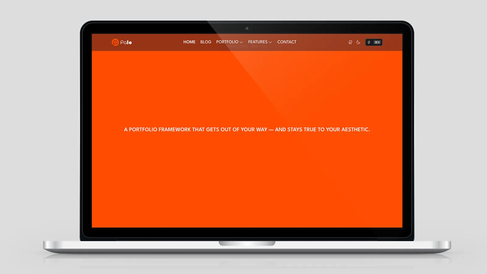
Homepage Video Hero (current Palo)
From src/pages/index.astro:
<CreativeSection
  fullscreen={true}
  class="py-16 bg-neutral-900 text-neutral-100"
  alignV="bottom"
  alignH="center"
  divider="both"
  useContainer={false}
  bg={{
    image: '/bg-video.jpg',
    video: '/bg-video.mp4',
    overlayOpacity: 0.25,
  }}
>
  <p class="text-xl font-semibold">
    A PORTFOLIO FRAMEWORK THAT GETS OUT OF YOUR WAY — AND STAYS TRUE TO YOUR AESTHETIC.
  </p>
  <p class="text-neutral-300">Background video credit line…</p>
</CreativeSection>
Image + video: JPG poster under MP4 for fast first paint.
图片 + 视频:JPG 海报垫在 MP4 下方,加快首屏。
Footer Brand Block (current Palo)
From src/components/Footer.astro:
<CreativeSection
  class="bg-primary py-4 sm:py-8 md:py-16"
  alignV="center"
  alignH="left"
  divider="none"
  useContainer={false}
>
  <Slogan
    text="Palo, The Best Astro Theme For You. "
    variant="marquee"
    speed="fast"
    class="text-secondary uppercase text-3xl md:text-5xl lg:text-9xl"
  />
  <img src="/branding/logo-text.svg" class="w-full" alt="" />
</CreativeSection>
Pairs naturally with Slogan Component.
Styling with Tailwind & Semantic Colors
Apply layout, spacing, and colors on the root class:
<CreativeSection class="bg-info text-neutral-100 py-24">
  <h2>Info Section</h2>
  <p>Using semantic Tailwind utilities</p>
</CreativeSection>
contentColor sets --section-color for inherited text. Tailwind text-* on children overrides per-element.
contentColor 设置 --section-color 继承文字色;子元素上的 Tailwind text-* 可单独覆盖。
Tips
Use
bgobject — flat props likebackgroundImageare removedPair image + video — poster image improves LCP while video loads
Set
overlayOpacity0.2–0.5 on photo/video backgrounds for readable textReserve
fullscreenfor one hero per page — avoid stacking multiple full-viewport sectionsUse
useContainer={false}for full-bleed logos, marquees, and edge-to-edge bandsbg.fixedsparingly — fixed backgrounds cost GPU memory on mobile使用
bg对象 — 已移除backgroundImage等平铺 prop图片 + 视频组合 — 海报图改善 LCP
图片/视频背景设置
overlayOpacity0.2–0.5 — 保证文字可读fullscreen每页最多一处 — 避免多个全屏区块堆叠全宽内容用
useContainer={false}— logo、跑马灯、通栏带谨慎使用
bg.fixed— 移动端 GPU 开销较大
Accessibility
| Feature | Behavior |
|---|---|
| Semantic HTML | Root is <section> |
| Decorative media | Background wrapper aria-hidden="true", tabindex="-1" |
| Video | Muted autoplay loop; hidden under prefers-reduced-motion: reduce |
| Overlay | Improves text contrast on busy backgrounds |
| Motion | Color transitions disabled under reduced motion |
Slot content (headings, links, buttons) follows normal accessibility rules — use proper heading hierarchy and contrast inside the section.
slot 内容(标题、链接、按钮)遵循常规范式——在 section 内保持正确的标题层级和对比度。
Conclusion
CreativeSection is Palo’s flexible full-bleed section: nested bg for image/video/color, alignment and divider controls, optional container, and a free slot for any content. Use it for homepage heroes and decorative bands; use PaloPageHeader when you only need a page title block.
CreativeSection 是 Palo 的灵活全宽 section:嵌套 bg 管理图片/视频/纯色、对齐与分割线控制、可选 container、自由 slot。homepage hero 和装饰性区块用它;仅需页面标题时用 PaloPageHeader。
Share this post
Like this post? Share it with your network!